A data quality dashboard turns dozens of scattered checks into a single view you can monitor at a glance. In Salesforce, the right dashboard tells you — in seconds — how trustworthy your data is, where the problems concentrate, and whether things are getting better or worse. This guide covers the metrics that matter and how to read them.
What a Data Quality Dashboard Is For
A dashboard answers three questions on a recurring basis:
- Can I trust this data today? A single headline number for an at-a-glance read.
- Where are the problems? A breakdown that turns the headline into specific, ownable tasks.
- Are we improving? A trend that shows whether your fixes are working and catches new issues early.
If a dashboard cannot answer all three, it is a report, not a monitoring tool.
The Metrics That Matter
A useful Salesforce data quality dashboard tracks a small set of complementary metrics rather than a wall of numbers:
| Metric | What it tells you | Why it matters |
|---|---|---|
| Data Quality Score | A single weighted 0–100 figure across all dimensions | The headline. One number leaders can track over time. |
| Dimension breakdown | Score per dimension (completeness, validity, uniqueness, consistency, timeliness) | Shows what kind of problem dominates |
| Field health | Pass/fail rate per field | Shows where exactly the problem lives — the actionable layer |
| Trend over time | The score across successive scans | Shows whether you are improving and surfaces new issues fast |
| PII exposure | Records and fields containing sensitive data | Critical before any Agentforce or AI project |
| Worst offenders | The objects and fields driving the most failures | Tells you where to start |
Together these move you from “how healthy is the data?” down to “which field, on which object, do we fix first?” in three clicks.
How to Read the Dashboard
Read it top-down, from headline to action:
- Headline. Glance at the Data Quality Score. Up from last scan? Down? Flat?
- Dimension. Open the dimension breakdown to see which type of problem is pulling the score down — a completeness problem and a uniqueness problem call for very different fixes.
- Field. Drill into the weakest dimension’s field health to find the specific fields driving failures. This is the layer someone can own and fix.
- Trend. Check the trend line. A sudden dip usually means a new integration or process started writing bad data — catch it here, not in a broken report three months from now.
Why Trends Beat Snapshots
A single measurement is obsolete the day after you take it, because Salesforce data changes constantly. The real value of a dashboard is the trend. A score of 82 means little on its own; 82 and falling for three weeks is an alarm, while 82 and climbing is proof your program works. Scheduled scans are what turn a one-time audit into a trend you can manage — and what let you set a target and watch the line move toward it.
What “Good” Looks Like
There is no universal passing score; it depends on how the data is used. The following targets are illustrative starting points, not Salesforce standards or evidence of regulatory compliance. Agree thresholds with the owners of each process:
| Data | Target |
|---|---|
| Regulatory / compliance fields | 99%+ |
| Customer-facing and revenue data | 95%+ |
| Operational data | 85%+ |
| Historical / archival data | 70%+ |
Set the target per dimension and per object, then let the dashboard tell you how far each one has to go.
Building It in DQS
Data Quality Sense provides this dashboard inside Salesforce through Insight Studio. After you run a scan from the Definition Builder, Insight Studio shows the weighted Data Quality Score, the per-dimension breakdown, field health, and the trend across scans — plus PII exposure for AI-readiness work. Results reflect the most recent completed scan. Display its timestamp alongside the scores so readers can distinguish a fresh result from a stale snapshot. Scans run inside Salesforce; data export is not required for measurement.
Review a Dashboard in DQS
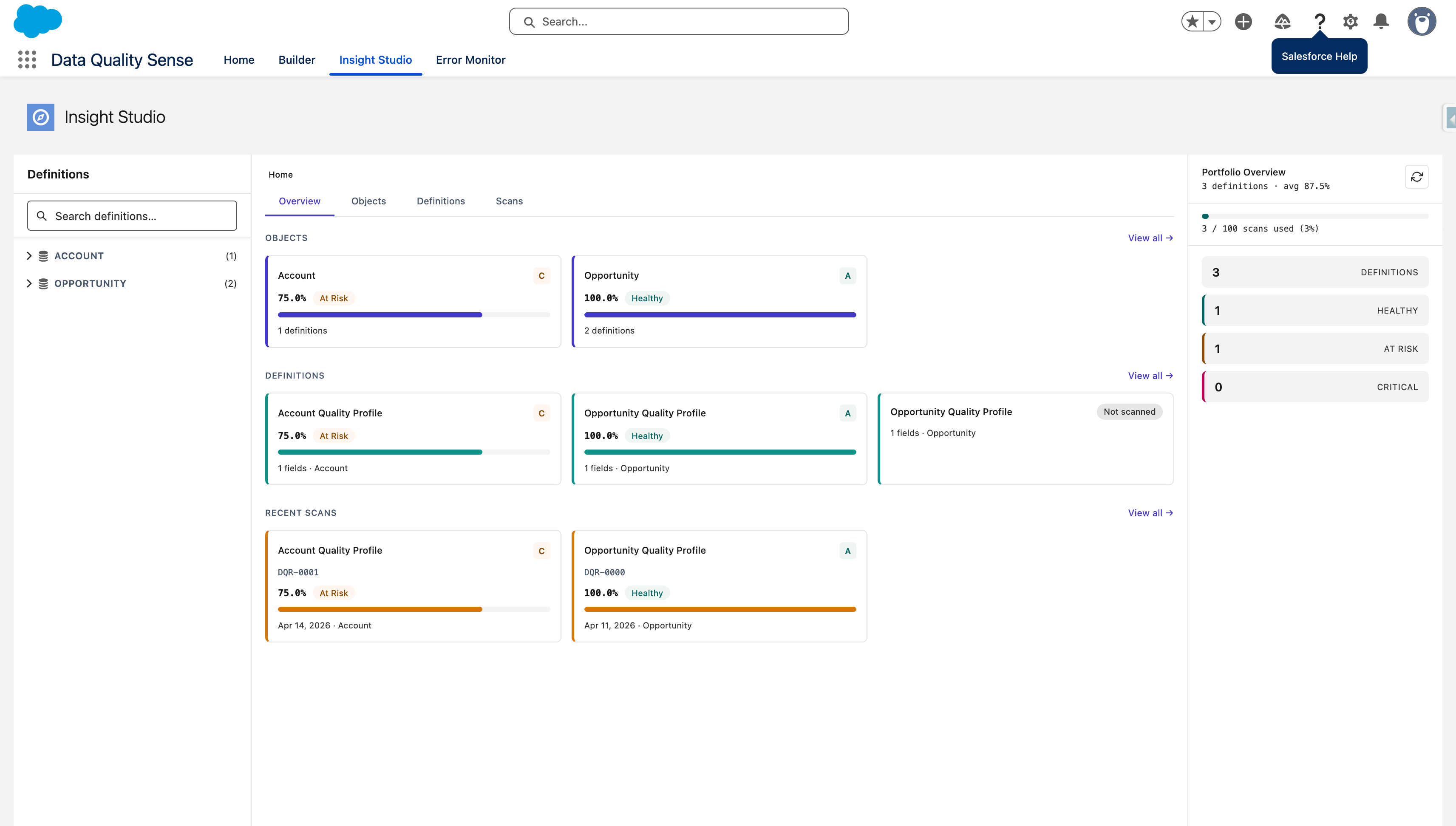
The screenshot shows the product interface, not a customer performance benchmark. Use the dimension and field results to identify what needs investigation, then compare scans after remediation.
A Weekly Review Example
Suppose a scan finds Account Industry completeness at 82%, down from 90%. Before assigning work, check that the object filter, selected fields, and scanned population match the previous run.
| Review step | Question | Follow-up |
|---|---|---|
| Scope | Did the same population and checks run? | Explain configuration changes before comparing scores |
| Cause | Are missing values concentrated in a recent import? | Inspect the affected records and import mapping |
| Owner | Who can correct the source and existing records? | Assign a named business or integration owner |
| Verification | Did the correction improve the next scan? | Compare the same scope and retain both scan timestamps |
These figures are an example. A higher overall score must not hide a critical failing field. For AI use cases, review PII and content checks separately; a composite score alone does not establish that an Agentforce deployment is ready.
Use the measurement guide for the calculation and completeness reference for the checks behind a fill-rate problem.
Next Steps
- How to Measure Data Quality in Salesforce: the Data Quality Score in depth
- Data Quality in Salesforce: the complete guide
- How to Improve Data Quality in Salesforce: from dashboard to action
- Measuring Data Quality: KPIs and scorecards in depth